

Managing a project without a Gantt chart is a bit like trying to pack for a trip without a list, you’ll probably forget something important, and tasks will start stepping on each other’s toes. Gantt charts give you a visual timeline of what needs to happen, when it starts, and how long it takes. They’re genuinely one of the best ways to keep a project on track.
The good news? You don’t need expensive software to make one. Microsoft Excel, which you probably already have, can build a solid Gantt chart in just a few minutes. In this guide, we’ll walk you through three ways to do it: using a built-in template (the fastest route), building one from scratch with a stacked bar chart, and an advanced method using conditional formatting for a more dynamic result. We’ll also be honest about when Excel is the right tool and when you should probably reach for something else.
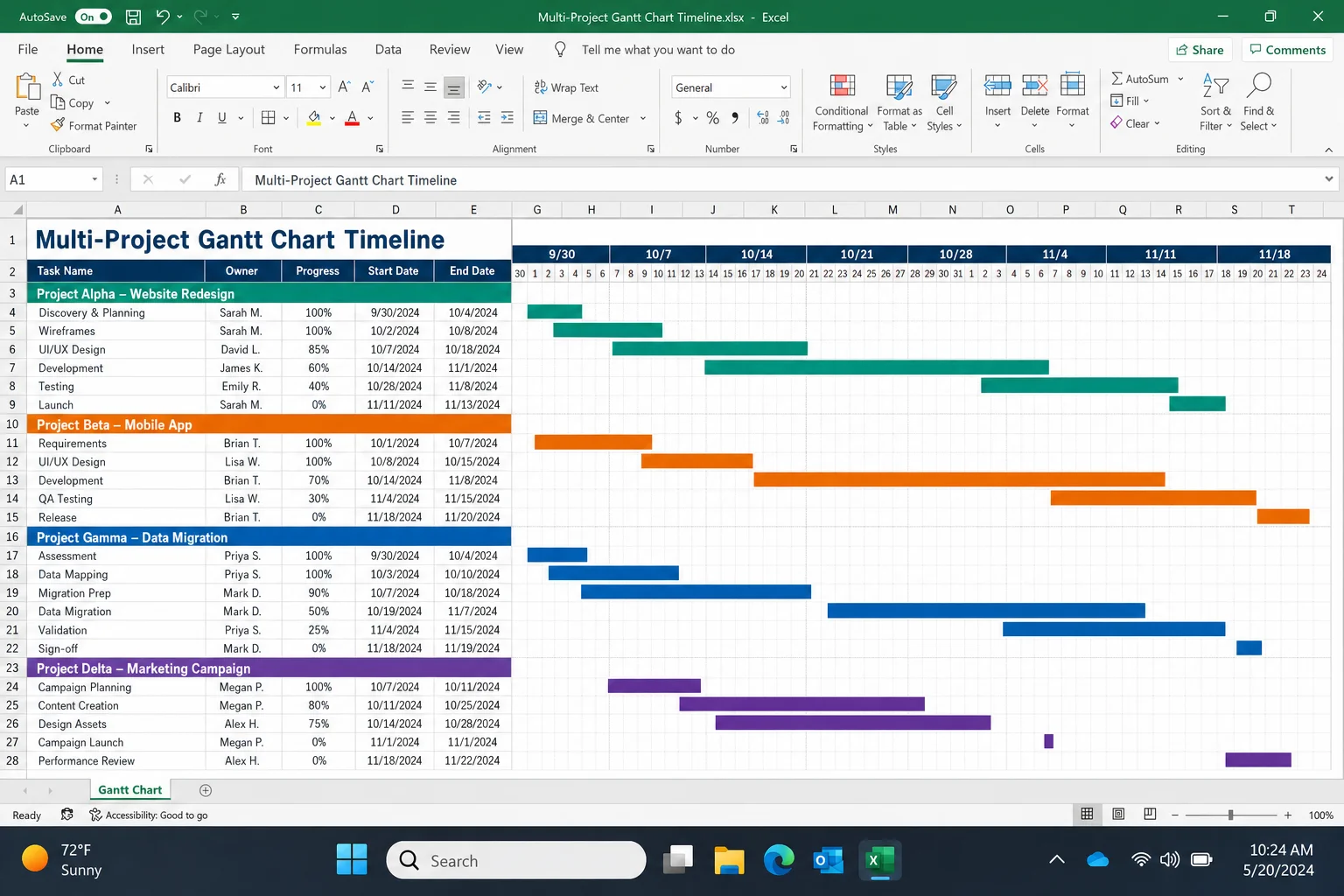
What Is a Gantt Chart?
A Gantt chart is a type of bar chart that maps out a project’s tasks along a timeline. Each task gets its own horizontal bar. The bar starts where the task begins and ends when it’s done. At a glance, you can see which tasks overlap, which ones depend on others finishing first, and how the whole project flows from start to finish.
Gantt charts are great for:
- Tracking multiple tasks with different start dates and durations
- Spotting scheduling conflicts before they happen
- Sharing a project timeline in presentations or reports
- Managing small-to-medium projects without dedicated software
Before You Begin
Make sure you have:
- Microsoft 365 Excel on Windows, macOS, or Excel for the web (all three work for this guide)
- A basic list of tasks, their start dates, and how long each one takes (in days)
That’s really it. No add-ins, no formulas to memorize, just Excel and a handful of data points.
Method 1: Use a Gantt Chart Template (Fastest)
If you just want a Gantt chart and don’t need to build one from scratch, Excel’s built-in templates are surprisingly good. Microsoft has put real effort into these, and they come pre-wired with the right chart type, data table, and formatting. This is honestly the best starting point for most people.
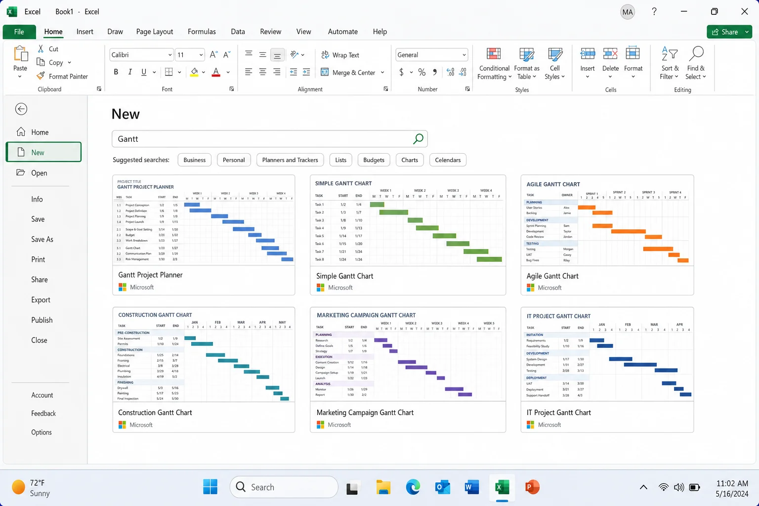
Step 1: Open a New Workbook and Search for “Gantt”
Open Excel and go to File > New. In the search bar, type Gantt and press Enter. You’ll see several Gantt chart templates from Microsoft, pick the one that looks closest to what you need.
Step 2: Fill In Your Task Data
Once the template opens, you’ll see a pre-built data table, usually with columns for Task Name, Start Date, Duration, and sometimes Status or % Complete. Just replace the placeholder data with your own tasks. The chart updates automatically as you type, which is pretty satisfying to watch.
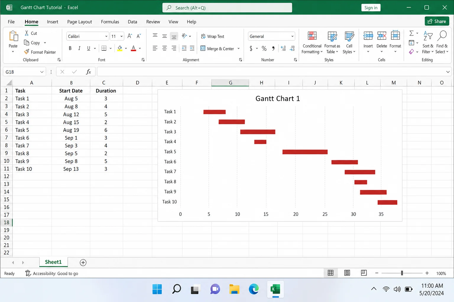
Step 3: Adjust the Date Axis If Needed
If the timeline looks cramped or doesn’t cover your full project dates, click on the horizontal axis (the dates at the top or bottom of the chart). Right-click and choose Format Axis, then adjust the Minimum and Maximum values to match your project’s date range. You can also change the Major unit from days to weeks if your project spans a longer period.
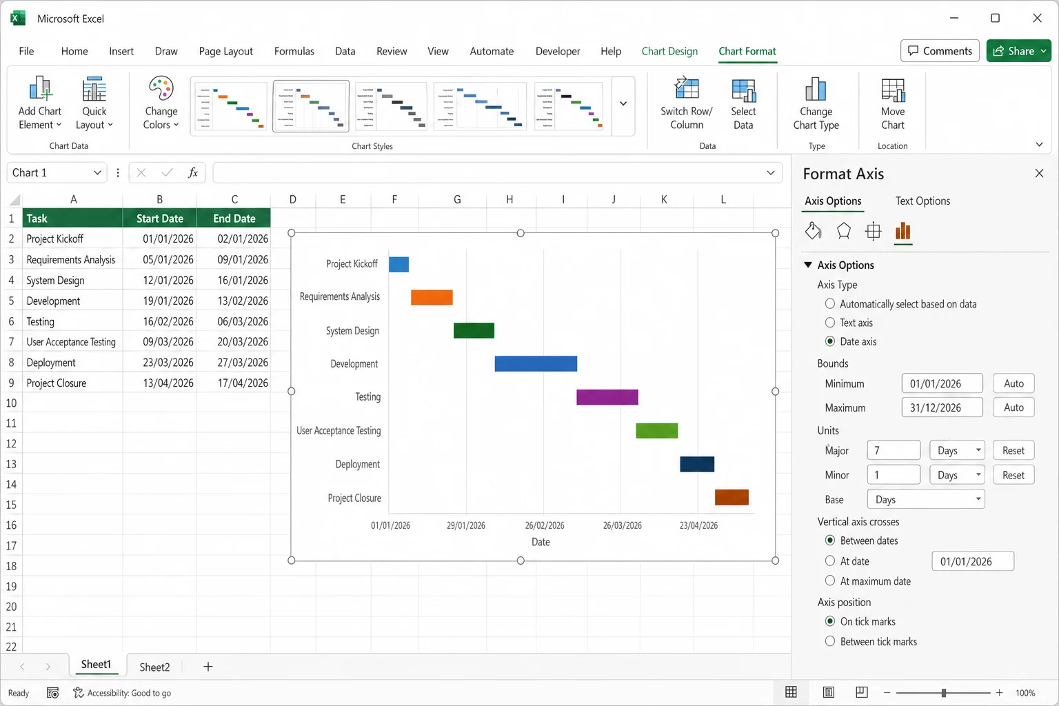
Step 4: Update as Your Project Progresses
As tasks get done, just update the duration or status fields in the data table. The bars in the chart will adjust automatically. Easy.
Tip: If you’re a Microsoft 365 subscriber with Copilot enabled, you can skip the template entirely and ask Copilot to build the initial data table and stacked bar chart for you using natural language, something like “Create a Gantt chart table for a 6-week website redesign project.” Then refine it from there.
Method 2: Build a Gantt Chart from Scratch
If the template doesn’t fit your needs, or you just want full control over how everything looks, building one from scratch isn’t as complicated as it sounds. The trick is that Excel doesn’t have a dedicated “Gantt chart” type. Instead, you build one using a stacked bar chart and then make the first series invisible. It’s a clever workaround, and once you’ve done it once, it clicks immediately.
Step 1: Set Up Your Data Table
Start with a blank workbook. Create a simple table with three columns:
- Column A, Task name (e.g., “Research,” “Design,” “Development”)
- Column B, Start date (make sure these cells are formatted as dates, not plain text)
- Column C, Duration in days (a plain number, like 5 or 14)
Include a header row. Your table might look something like this:
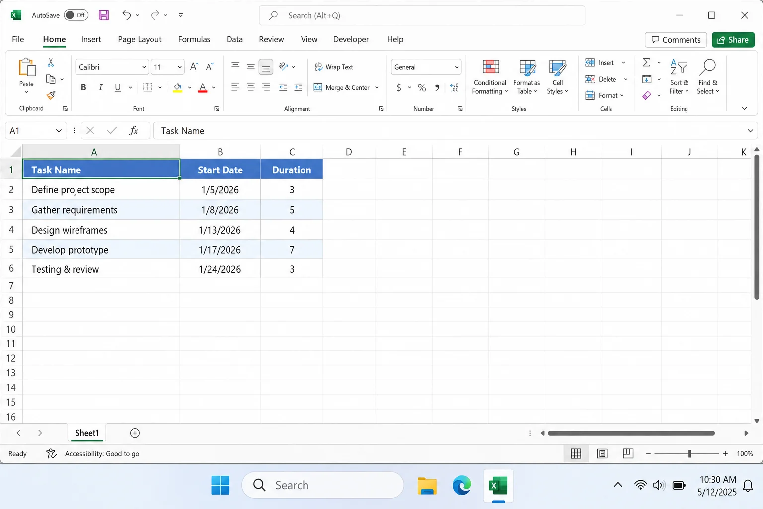
If you’d rather track end dates instead of duration, you can add an end date column and use a formula to calculate duration automatically. Just subtract the start date from the end date in a separate column.
Step 2: Select Your Data and Insert a Stacked Bar Chart
Select all the data in your table, from the top-left cell (your header) down to the last row of data. If your data runs from A1 to C6, select that whole range.
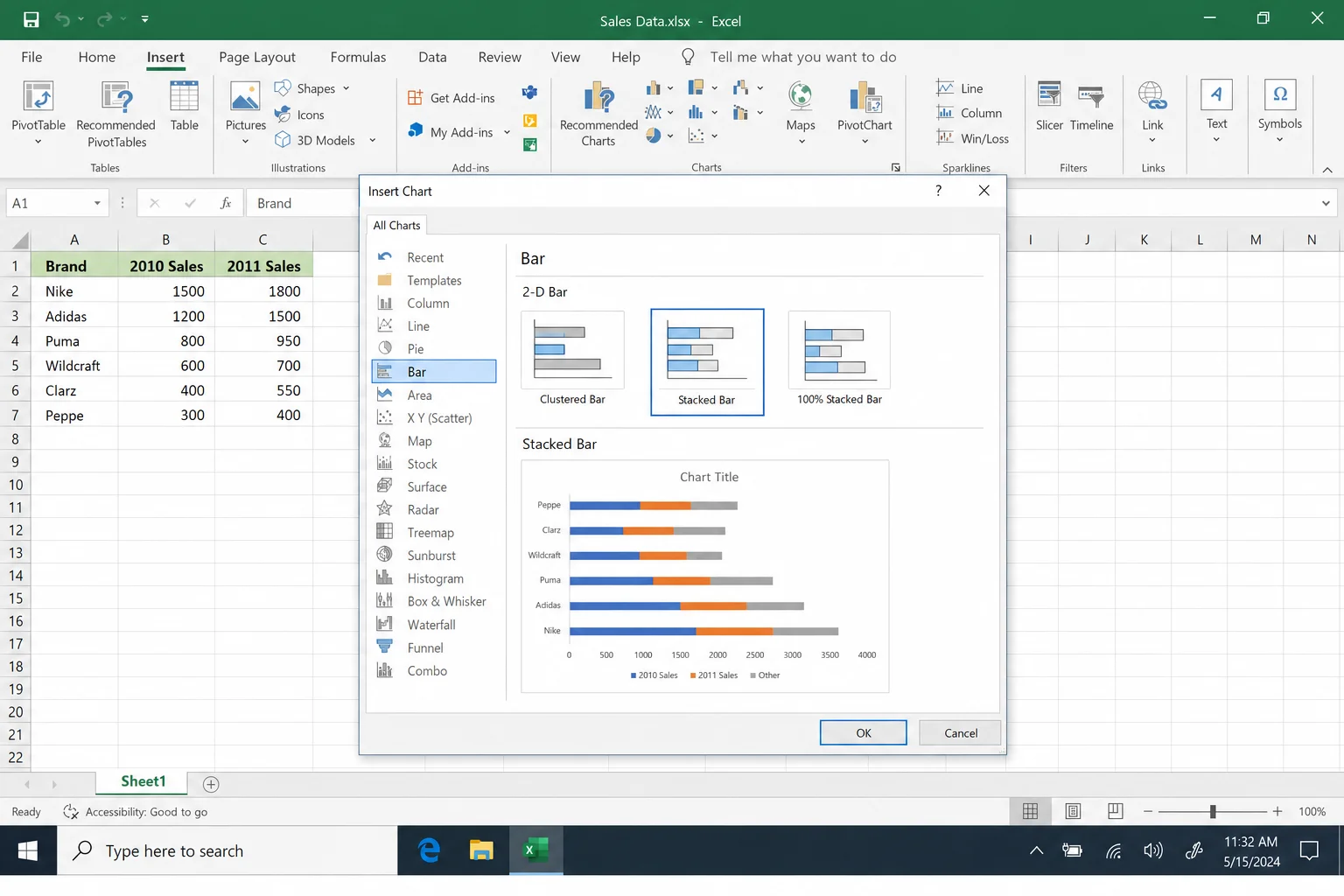
Then go to Insert > Recommended Charts > All Charts > Bar. Choose Stacked Bar, not “100% Stacked Bar,” which is a different thing entirely and won’t work here.
Step 3: Clean Up the Chart
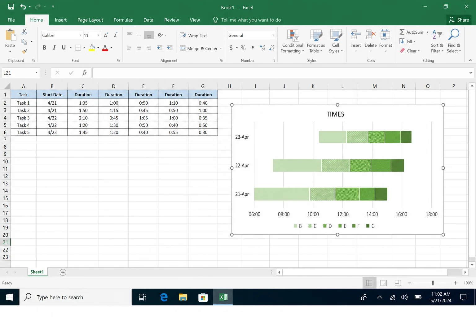
Excel will drop a new chart into your spreadsheet. It’ll look a bit rough at first, that’s normal. Go ahead and:
- Resize the chart by dragging its corners to make it more readable
- Click the Chart Title box and rename it to something useful
- Click the legend at the bottom of the chart (where it says “Start Date” and “Duration”) and press Delete to remove it, you don’t need it
Step 4: Reverse the Task Order
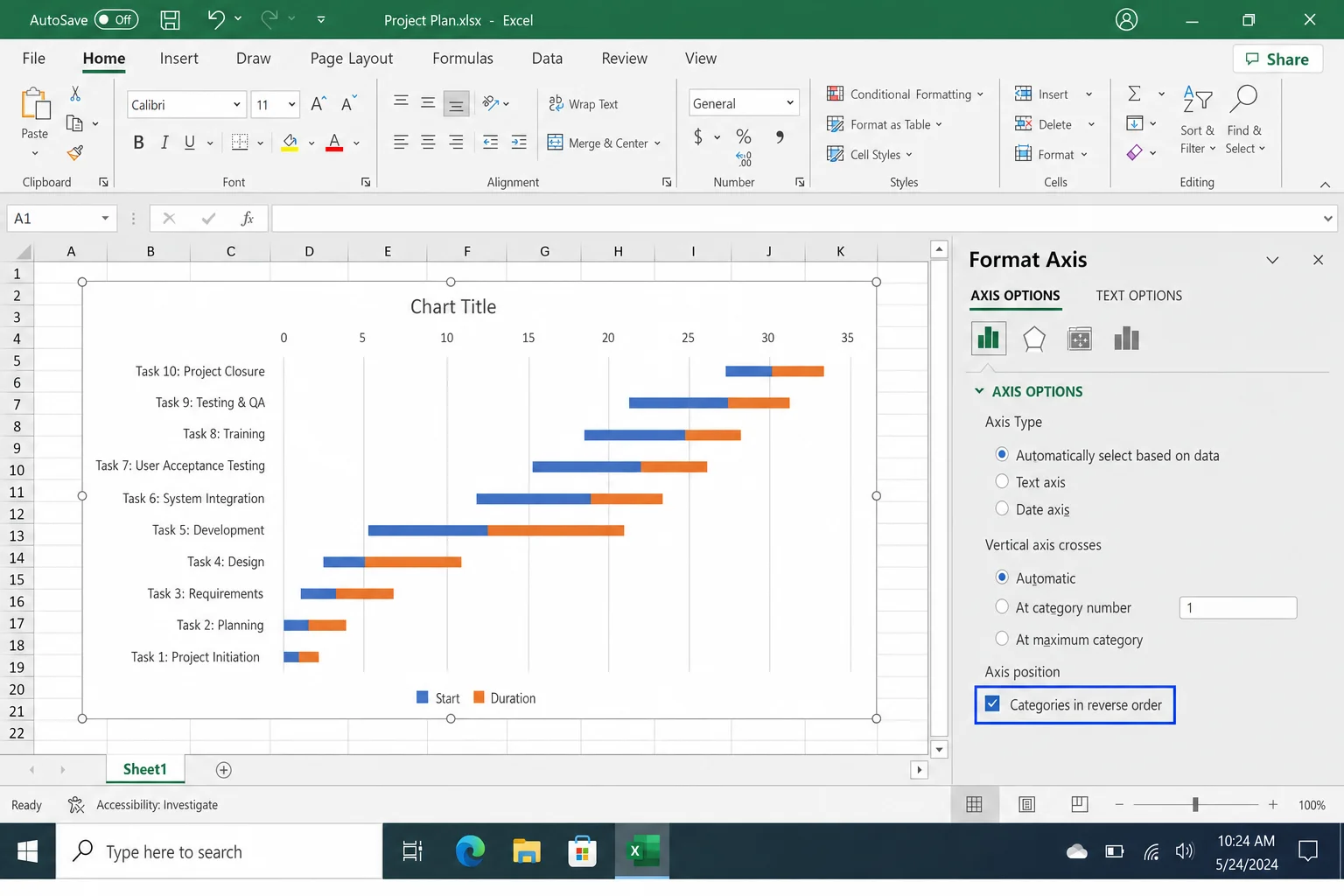
Right now, your last task is probably sitting at the top of the chart and the first task is at the bottom. That’s backwards from how a Gantt chart should read. Here’s how to fix it:
- Click on the vertical axis (the task names on the left side of the chart) to select it.
- Right-click and choose Format Axis.
- In the Format Axis panel that opens on the right, check the box next to Categories in reverse order.
Your first task will now appear at the top, which is exactly where it should be.
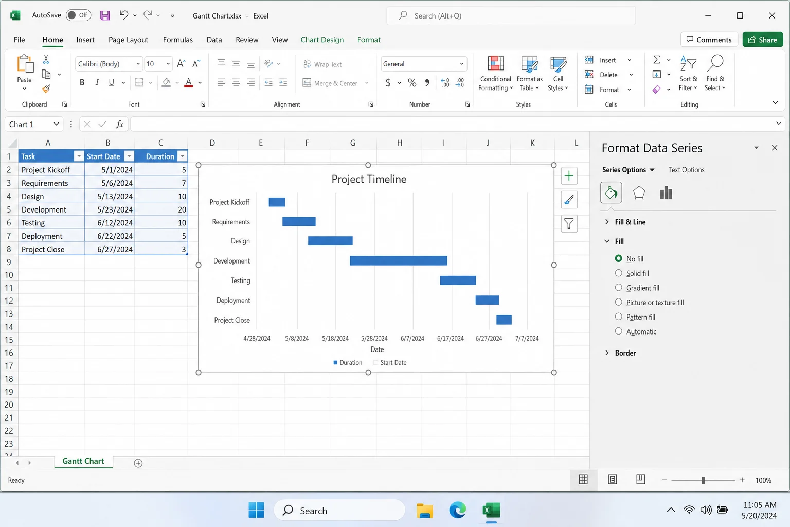
Step 5: Hide the Start Date Series
This is the key step that turns a stacked bar chart into a Gantt chart. The first colored segment in each bar represents the start date, but in a real Gantt chart, you only want to see the duration bar. So you need to make the start date segment invisible.
- Click on one of the start date bars in the chart (the first colored segment on the left of each bar). Click once to select the whole series.
- Right-click and choose Format Data Series.
- In the Format Data Series panel, click Fill & Line (the paint bucket icon).
- Under Fill, select No fill.
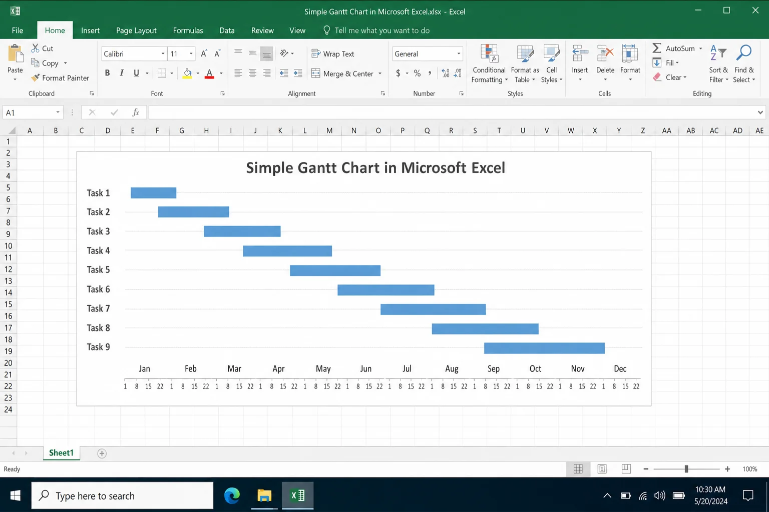
The start date bars will disappear, leaving only the duration bars floating at the right position on the timeline. That’s your Gantt chart!
Step 6: Fix the Time Scale (Don’t Skip This)
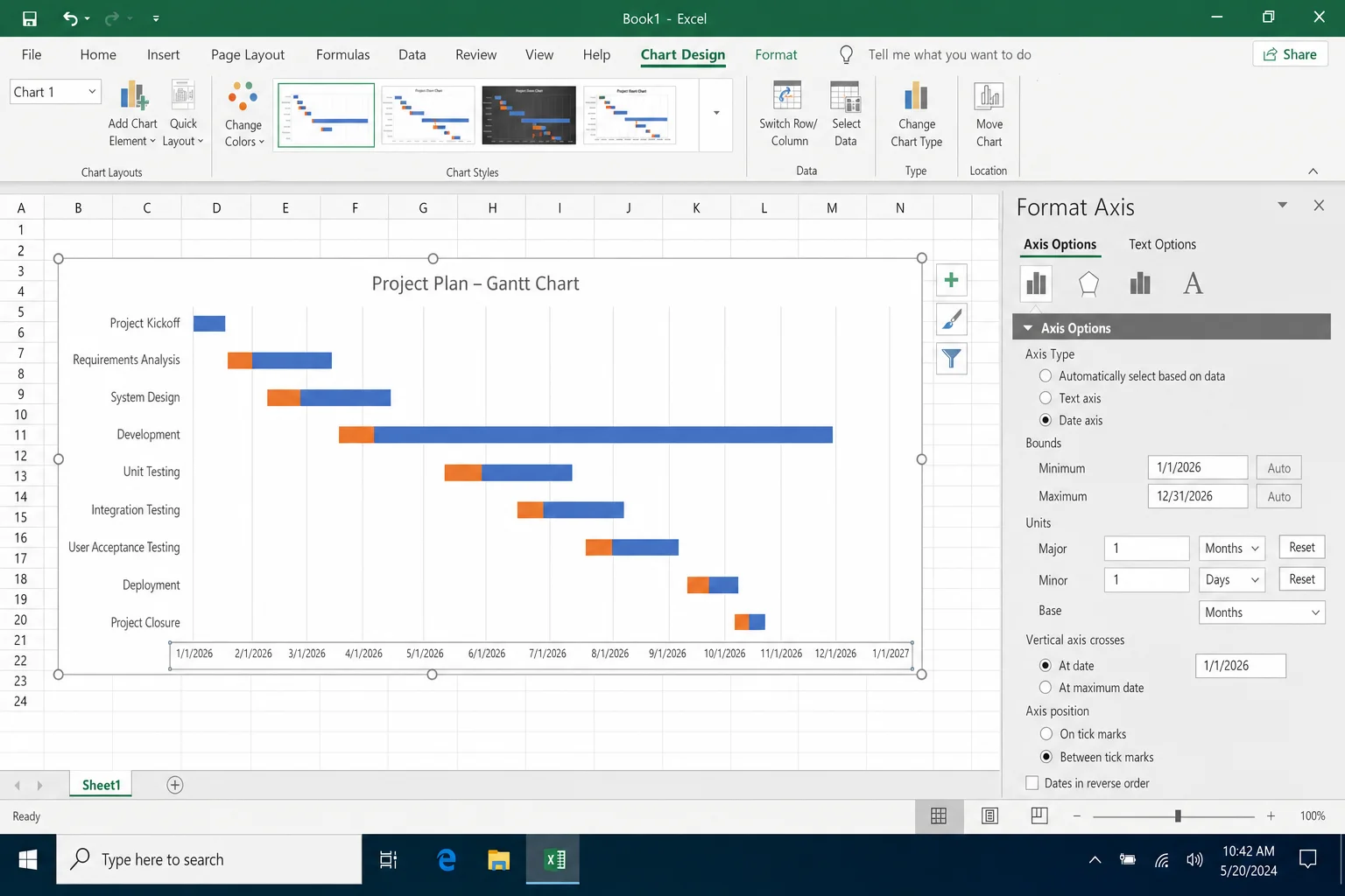
This step gets skipped in a lot of tutorials, but it makes a big difference in how readable your chart is. If the date axis doesn’t line up with your actual project dates, the chart can look weird or cramped.
- Click the horizontal axis (the dates along the bottom or top of the chart).
- Right-click and choose Format Axis.
- Set the Minimum to match your earliest start date and the Maximum to a date after your last task ends.
- Adjust the Major unit, for short projects, keep it in days; for longer ones, switch to weeks so the labels don’t overlap.
Step 7: Optional, Add Color and Polish
Your Gantt chart is functional now, but you can make it look a lot better with a few extra touches:
- Change bar colors: Click a duration bar, then use Format > Shape Fill to pick a color. You can color-code bars by status (green = done, yellow = in progress, red = at risk).
- Add data labels: Go to Chart Design > Add Chart Element > Data Labels to show duration numbers on the bars.
- Save as a template: If you’ll be making Gantt charts regularly, go to Chart Design > Save as Template so you can reuse your formatting next time.
Method 3: Dynamic Gantt Chart with Conditional Formatting (Advanced)
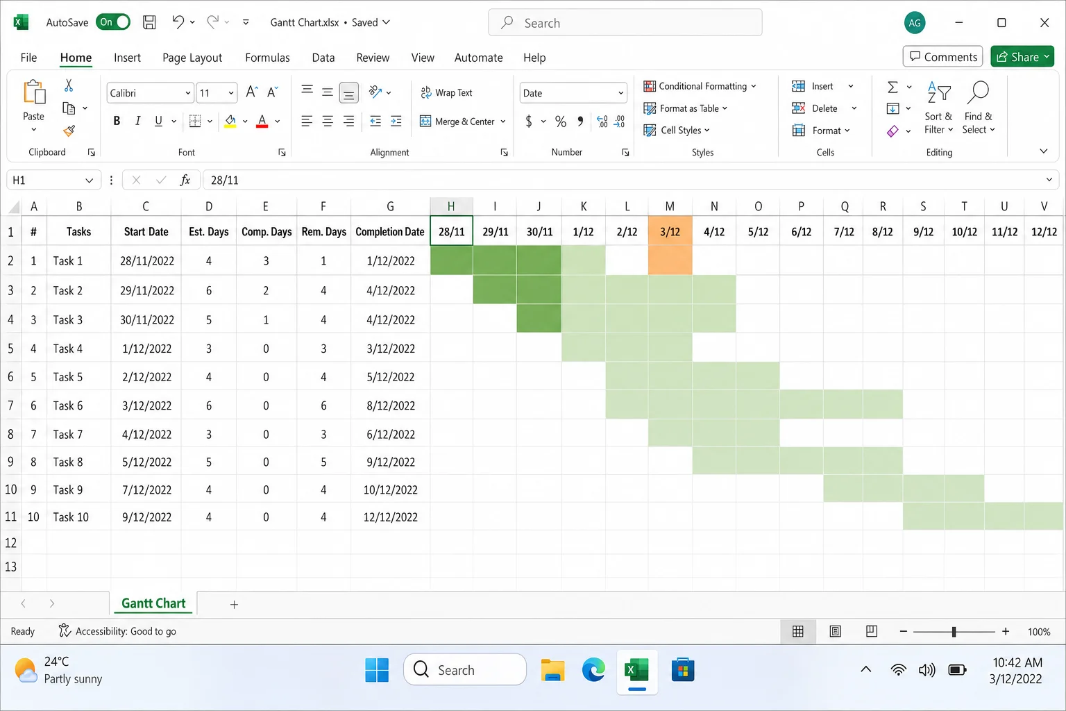
Here’s something that caught my eye when researching this guide. You can actually build a Gantt-style timeline in Excel without using a chart at all. Instead, you use conditional formatting to color individual cells based on whether they fall within a task’s date range. The result is a spreadsheet that looks like a Gantt chart and updates dynamically, including highlighting today’s date and even weekends.
This approach is a bit more involved, but it’s worth it if you want something that’s easier to update over time than a traditional chart.
Step 1: Build Your Task Table
Set up a table with four columns: Task, Start Date, Duration, and End Date. You can calculate End Date automatically with a formula like =B2+C2 (start date plus duration).
Step 2: Create a Timeline Header Row
In a row above or to the right of your task table, add a sequence of dates across multiple columns, one date per column, covering your entire project period. These become the “columns” of your Gantt grid.
Step 3: Apply Conditional Formatting
- Select the grid of cells where your task rows meet your date columns.
- Go to Home > Conditional Formatting > New Rule.
- Choose Use a formula to determine which cells to format.
- Enter a formula that checks whether the column’s date falls between the task’s start and end dates. For example:
=AND(D$1>=$B2, D$1<$D2)adjusting the cell references to match your layout. - Choose a fill color for the matching cells. Click OK.
You can add additional rules to highlight today’s date in a different color, or shade weekends gray, which makes the timeline much easier to read at a glance.
When Excel Is Enough, And When It’s Not
Excel Gantt charts are genuinely useful, but they’re not the right tool for every situation. Here’s an honest breakdown:
Excel works great when you:
- Have a small or medium-sized project with a manageable number of tasks
- Already track your project data in a spreadsheet
- Need a quick visual timeline for a presentation or report
- Want to export tasks from Microsoft Planner into a visual chart
Excel starts to struggle when you:
- Need to manage task dependencies (e.g., “Task B can’t start until Task A finishes”); Excel has no built-in way to handle this automatically
- Have a large, fast-moving project where the plan changes frequently, so keeping the chart updated manually becomes a real chore
- Need real-time collaboration with a team across different locations
Better alternatives to consider:
- Microsoft Project / Project for the web: Full Gantt support with dependencies, resource management, and automatic scheduling
- Microsoft Planner Premium: Task boards and timeline views built for team collaboration, worth exploring if your team is already in Microsoft 365
- Power BI: If you want an interactive, always-up-to-date Gantt chart that pulls data from Excel or Planner, Power BI’s Gantt custom visual is excellent
- Asana, Smartsheet, or Monday.com: Dedicated project management tools with proper Gantt features if you need something purpose-built
Tips and Troubleshooting
Common Issues
Problem: The bars look offset or don’t line up with the right dates
This almost always means your horizontal axis minimum and maximum aren’t set correctly. Click the date axis, choose Format Axis, and manually set the bounds to match your project’s actual date range.
Problem: Tasks are in the wrong order (last task at the top)
Go to Format Axis on the vertical axis and check Categories in reverse order. That’ll flip them so your first task sits at the top where it belongs.
Problem: The dates on the axis are showing as numbers instead of dates
Excel is treating your dates as serial numbers (which is technically how it stores dates internally). Right-click the axis, choose Format Axis, and under Number, change the format to Date.
Problem: I accidentally selected the whole chart instead of just the start date series
This trips people up constantly. Click once on any bar to select the whole chart, then click again directly on one of the start date bars to select just that series. Then right-click and choose Format Data Series.
Problem: The chart looks too cramped or spread out
Adjust the Major unit in the horizontal axis format. Switch from days to weeks for longer projects, or zoom in to days for short ones. You can also rotate the date labels if they’re overlapping by going to Format Axis > Alignment.
Pro Tips
- Color-code by status: Use different fill colors for “in progress,” “completed,” and “not started” bars. It makes the chart much more useful at a glance.
- Export to Planner first: If your team tracks tasks in Microsoft Planner, export the task list to Excel and build your Gantt from there. It saves a lot of manual data entry.
- Save your chart as a template: Once you’ve got the formatting just right, save it via Chart Design > Save as Template. Next time, you can apply all your formatting in one click.
- Try Copilot: If you have Microsoft 365 with Copilot, ask it to generate your initial task table and chart. It won’t be perfect, but it’s a solid starting point that you can refine.
Wrapping Up
Building a Gantt chart in Excel is one of those things that sounds harder than it actually is, and once it clicks, you’ll wonder why you didn’t try it sooner. For most small projects, the built-in template is all you need. If you want more control, the stacked bar method gives you a fully custom chart in under 10 minutes. And if you want something that stays dynamic and updates automatically, the conditional formatting approach is a genuinely clever solution worth bookmarking.
Just keep in mind that Excel Gantt charts have real limits for large or complex projects. If you’re managing dependencies or collaborating with a big team, tools like Microsoft Project or Planner Premium are worth a look. But for lightweight planning and reporting? Excel does the job surprisingly well. If you’re looking for other ways to manage projects visually, Google Sheets also has some solid built-in options worth exploring.